Sparked
Sparks aim is to solve this by being a dating app meant to use the power of community to create genuine and meaningful connections. Unlike traditional dating platforms the profile is not made by the user but by the community.
After listening to my friends share their frustrations and negative experiences with online dating I saw a problem with the way the system works. There was a problem to the way online dating happens as it does not foster and environment for meaningful connections.
The Problem
Research & Ideation
For this study five individuals (sample size = 5) who fit the profile of my app's user were selected. I chose them based on age, gender, location (urban or rural) and if they were previous users of dating apps.
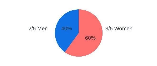
I chose to make sure my sample pools gender ratio was as similar as possible to those using dating apps. In my sample pool there are 3 women and 2 men.

I have interviewed individuals aged 20 to 22 to better understand the preferences and behaviors of my app’s target demographic, which is users between the ages of 20 and 29. This target age range was chosen because it represents the largest segment of dating app users
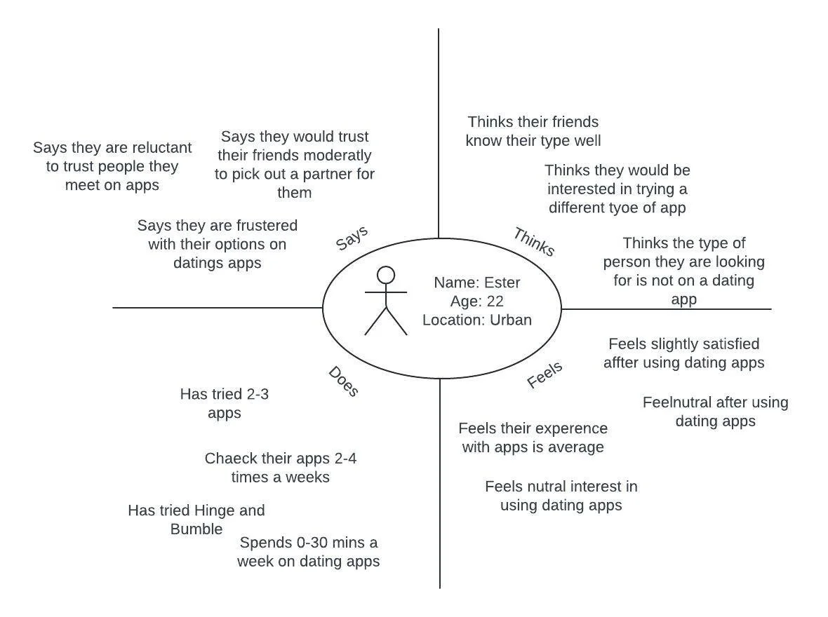
Empathy Map
UI Laws and Properties
Fittz Law
Here I used Fittz law to try and get the user to notice the "Message Now" button and encourage them to click it. On my first iteration of this I chose a small font that did not have a high contrast with the background and placed it in the corner. After thinking about Fittz law, I chose to make the button larger so users will notice it better and they will be more likely to click on it.

Zeigarnik Effect
The Zeigarnik is where users remember their uncompleted tasked more than their completed one. To implement this effect, I wanted to make matches feel like an uncompleted effect and non matches feel complete. To X a match is the end of that path, and X is the last step a user needs to do to say no to a match, this in turn makes the action feel complete as there is nothing more to do with the match. However if the user checks a match, then the action is not complete as the system brings them to another page, prompts them to message the person and allows them to continually message the person by showing there conversation on the home page. This makes the user feel like match is an uncomplete task
Usability Heuristics Incorporated:
-Visibility of System Status
-Match Between the System and the Real World
-User Control and Freedom
-Consistency and Standards
-Error Prevention
-Recognition Rather than Recall
-Flexibility and Efficiency of Use
-Aesthetic and Minimalist Design
-Help Users Recognize and Diagnose Errors
-Help and Documentation

Hicks Law
Hicks law states that it takes more time for a user to make a decision if there are numerous choices. In one of my first ideations, I thought about adding a star system to ranking profiles and a save for later as well as a neutral option. After taking Hicks law into consideration, I ended up with just the yes and no options for rating a profile.

I used my initial research to help narrow down the pool of candidates to get the most useful information from these questions. While I was interviewing, I paid attention to the interviewee and took note of additional information they said to include in their empathy map.
Persona
To create my user persona, I used the information given to me in the empathy maps. With analysis of my empathy maps I was able to see trends and similarities between those I interviewed. I took their wants and needs and meshed them together into a single personal that by enlarge represented an average user.

Ideate
With the ideas about who my user is, their problem and how I can solve it I went to the whiteboard to start ideating. I chose to do the Walt Disney’s Creative Strategy. At first, I was the dreamer then the critic and the realist.


Low Fidelity Prototype
The first way I started prototyping was with Sketching. Sketching is a distinctive from of drawing which allowed me to lay out my ideas and show representations of the user experience. Sketching was my first attempt at showing how a user sees the app and how it would use it

High Fidelity Prototype
In Figma I made each individual screens and connected them together to show how a user could flow through the app. I chose to do an app as I felt this makes the most sense given the type of actions the user would be doing and for ease of access. In Figma I translated by sketches and flow chart into a high-fidelity prototype.

